
在V2.X中CSS有一个bootstrap-responsive.css,而V3.X中没有了,请问如何实现RESPONSIVE。
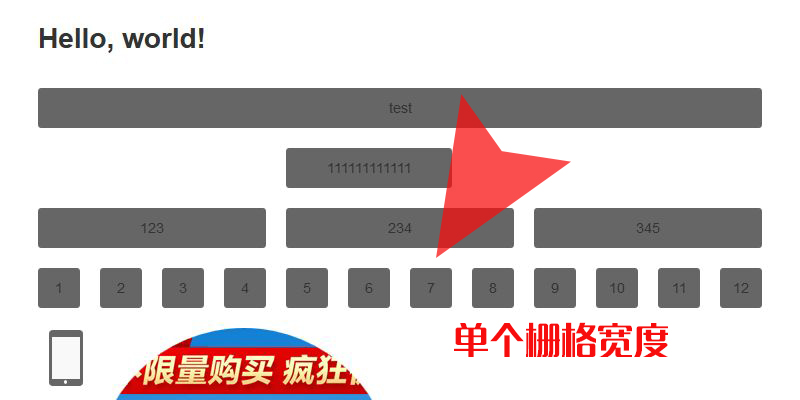
在之前试用V2.X时,如果一行用多个栅格,当页面变宽的时候,内容会随着页面的宽度改变,而非直接就开始上下叠加,而在V3.X中没有这个文件了,请大侠指点下如何实现这个效果,谢谢!
效果如下图。
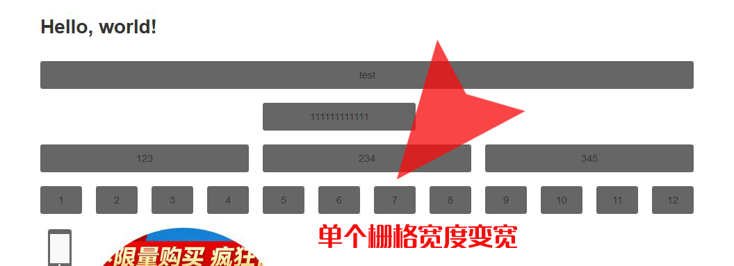
昨天测试了一下,发现在V2.X版本中,responsive.css文件对这个有决定性作用,请问在V3.X中如何实现的?
效果如下图。
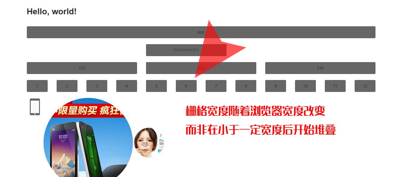
昨天测试了一下,发现在V2.X版本中,responsive.css文件对这个有决定性作用,请问在V3.X中如何实现的?